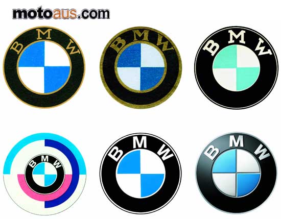
 The BMW Roundel, one of the world’s most recognised and revered commercial symbols, celebrates its 90th anniversary, on 5 October 2007

The BMW Roundel, one of the world’s most recognised and revered commercial symbols, celebrates its 90th anniversary, on 5 October 2007.
In July 1917 Franz Josef Popp registered the name Bayerische Motoren Werke, thus distancing the new company from the Rapp Motorenwerke. This was a necessary move if the new company was to find new clients and prosper. The name was registered but as yet there was no new logo.
It was on October 5 1917 that the BMW trademark was registered with the Imperial Trade Mark Roll under No. 221388. It featured the circular design of the Rapp logo but with the letters BMW at the top of the outer ring and the inner featuring quadrants in the Bavarian Free State colours of blue and white but in the opposed order, as it was illegal to use national symbols in a commercial trademark. The design was not in anyway connected with aircraft engines or propellers.
The idea that the blue and white had anything to do with spinning propellers comes from a 1929 ad, which featured aircraft with the image of the Roundel in the rotating propellers. This ad came at the beginning of the Great Depression, which coincided with BMW acquiring the license to build Pratt & Whitney radial aircraft engines. The advertising department used the Roundel and BMW heritage in an attempt to increase sales of the new radial motors. The idea of the spinning propellers was given greater credence in an article by Wilhelm Farrenkopf in a BMW journal of 1942. This also featured an image of an aircraft with a spinning Roundel. These were powerful images and the legend of the spinning propeller was born. The logo was registered on 5 October but it was in limited use prior to this date.
On 1 October 1917 Franz Josef Popp was given a certificate confirming his appointment as General Manager and it was adorned with the now familiar BMW Roundel. The basic structure of the Roundel has remained the same over 90 years but there have been subtle changes. In the original design the lettering and outline was in gold, but by the time the first BMW motorcycle, the R 32 was released in 1923 it had changed slightly. The letters were still in gold but the font was bolder and letters closer together.
This was the style that was submitted to the German Register of Trade Marks in 1933, and the international register of trade marks in 1934. This did not however stop various versions being used. One of the early BMW advertisements using the logo was in 1918 with the ‘Falling Roundels’, this was a positioning ad attempting to establish the brand and give an indication to its current and future products. Subsequent ads, posters and even cars and motorcycles also featured many styles of Roundel. The proportions changed, the shade of blue used, and the lettering could be in gold, white or silver with serif or sans-serif fonts in different sizes. There appears to be no reason for this variance except for product designers and marketing and communication staff using personal choice depending on application. Through the 1950s there was a more concerted effort to standardise the Roundel.
The use of white lettering was now standard and when used on cars and motorcycles it was silver and by the 1960s the serif font was replaced by sans-serif, this was used on all motorcycles by 1966. There was a subsequent change to a slightly bolder font and this has remained as the standard Roundel. There was flirtation with a ‘Motorsport Roundel’ in the early 1970s and ’80s which had the standard logo surrounded by the BMW Motorsport colours. In 1997 BMW moved to having the Roundel depicted in 3-D when used in the printed form. This gives the Roundel a new bolder and dynamic look. The BMW Roundel is now ranked in the top ten of the world’s most recognised commercial logos and is an iconic symbol in its own right.
The original design, in its simplicity and symbolism has stood the test of time.
